What Colors Are Better for Outdoor Lighting and Why
Outdoor lighting does much more than help you see at night. Color temperature shapes how your home feels after sunset, how materials appear, how landscaping is perceived, and even how comfortable your guests feel in the space. Light color also affects safety, wildlife activity, and long-term energy performance. Selecting the right tone requires understanding how light interacts with architecture, plants, and the human eye.
Homeowners across Northeast Florida often assume brighter or whiter is better. That approach usually leads to glare, washed-out landscaping, and a harsh appearance that does not match the warmth of a residential setting. Careful color selection produces a layered, intentional design that enhances property value and nighttime curb appeal.
At Aloha Outdoor Lighting, we help homeowners in Jacksonville choose precise color temperatures that complement their architecture, finishes, and landscape features. Proper design ensures the lighting looks refined and comfortable rather than overpowering.
Understanding Color Temperature in Outdoor Lighting
Outdoor lighting color is measured in Kelvin. The lower the Kelvin number, the warmer and more amber the light appears. Higher Kelvin ratings produce cooler, whiter, and eventually bluish light.
Most residential outdoor lighting falls within the 2200K to 4000K range. Anything lower than 2200K tends to look very amber, similar to candlelight. Anything above 4000K begins to resemble commercial or security lighting often seen in parking lots.
Warm white light, typically 2200K to 3000K, contains more yellow and soft amber tones. Cool white light, typically 3500K to 4000K, appears crisper and more neutral. Daylight tones above 5000K are rarely appropriate for residential landscapes. They can create visual strain and flatten natural textures.
Color temperature also impacts how materials reflect light. Brick, stone, wood, and stucco all respond differently depending on the warmth or coolness of the source.
Why Warm White Lighting Works Best for Most Homes
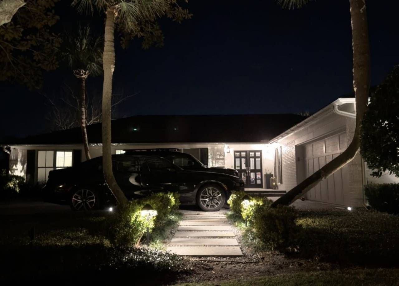
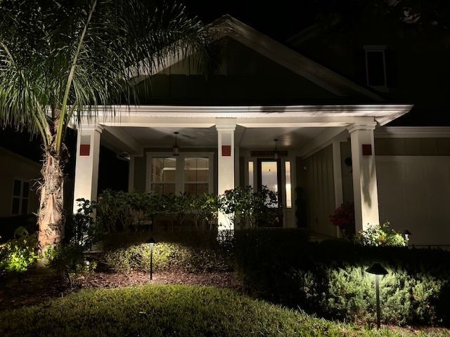
Warm white lighting between 2700K and 3000K remains the most versatile choice for residential properties. That range mimics traditional incandescent light, which our eyes naturally associate with comfort and relaxation.
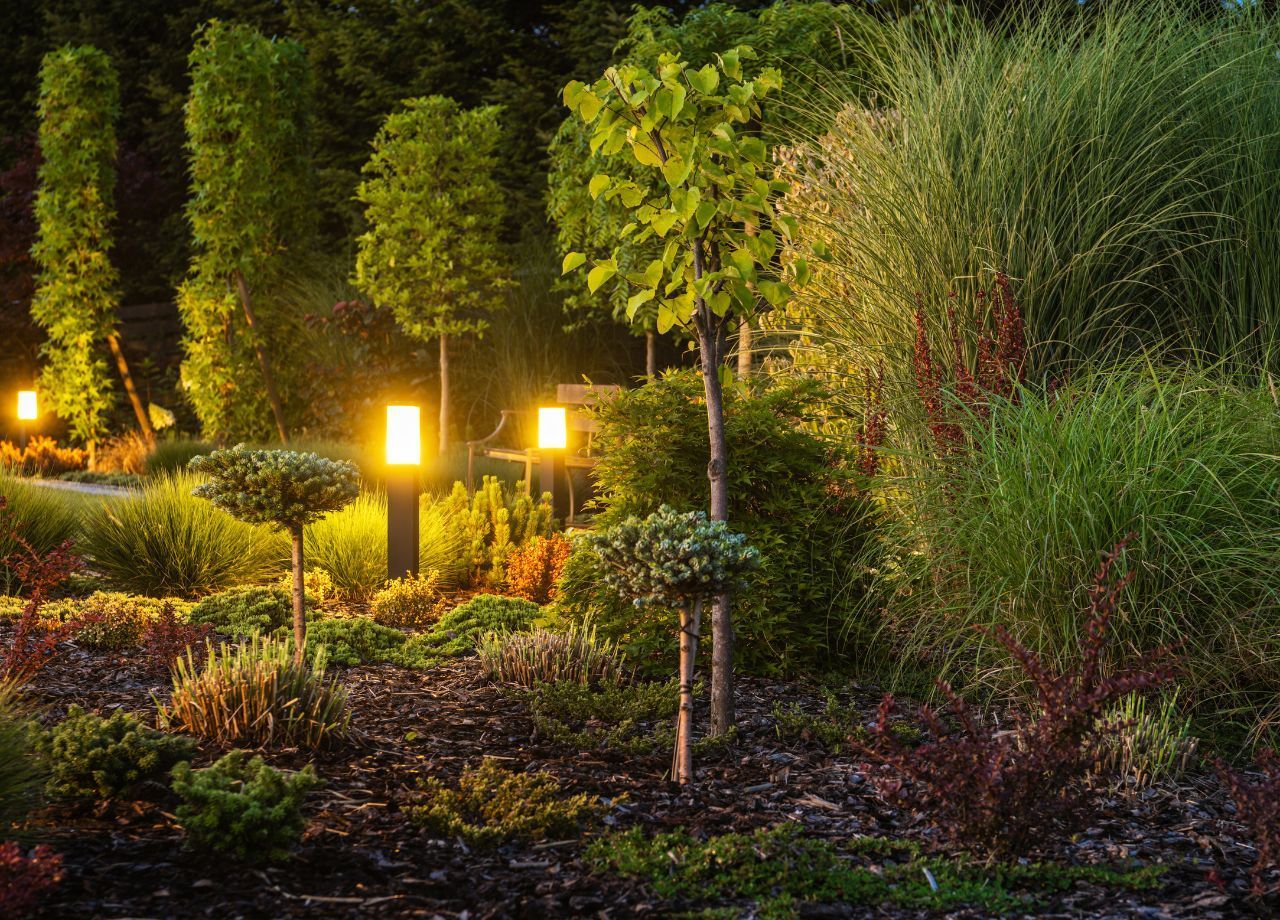
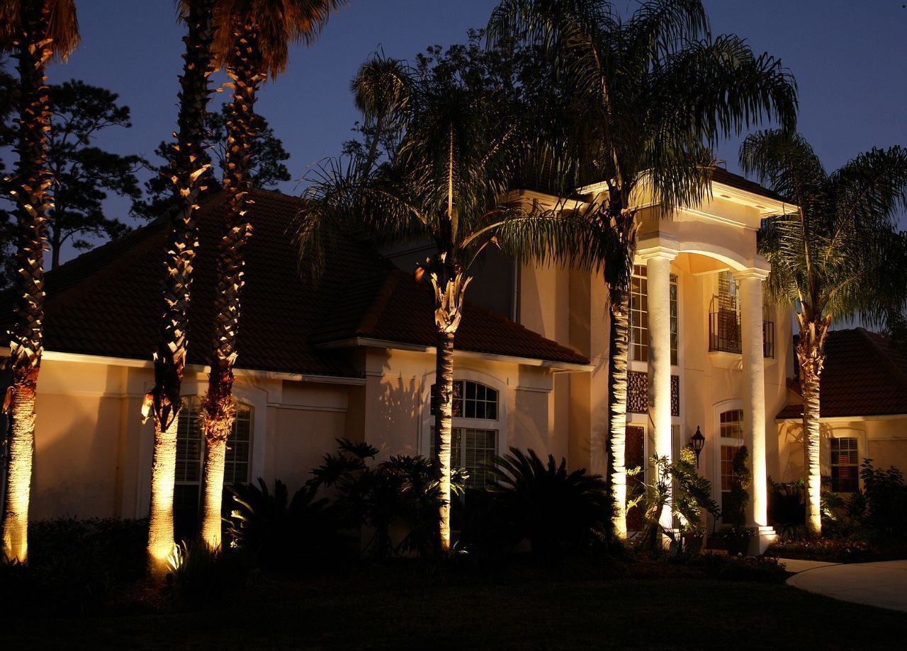
A 2700K tone creates a soft, welcoming glow that complements brick homes, Mediterranean architecture, coastal properties, and traditional Southern designs. Jacksonville neighborhoods with warm-toned exteriors often benefit from this range because it enhances reds, tans, and earthy materials rather than dulling them.
At 3000K, the light becomes slightly cleaner while still maintaining warmth. This works well for painted exteriors, light-colored stucco, and transitional architecture. Landscaping also benefits from this range. Green foliage appears rich and healthy without looking overly saturated.
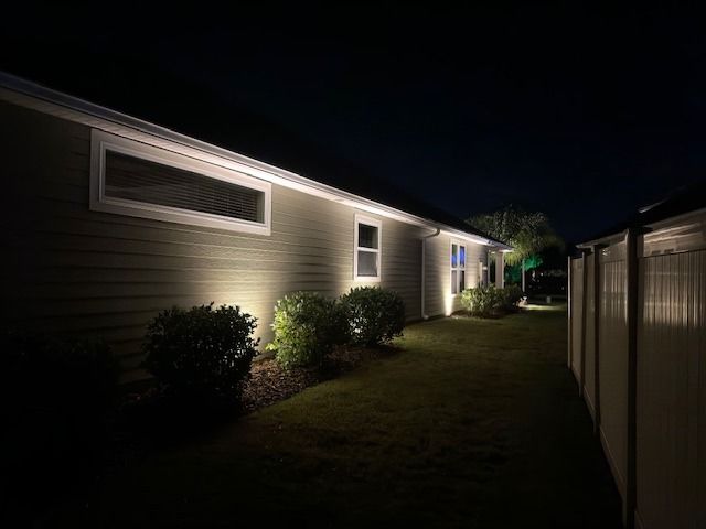
Warm lighting reduces glare and harsh shadow lines. That matters when illuminating entryways, columns, textured stone, or layered plant beds. Guests experience a balanced glow instead of feeling like they are walking into a spotlight.
When Cooler White Lighting Makes Sense
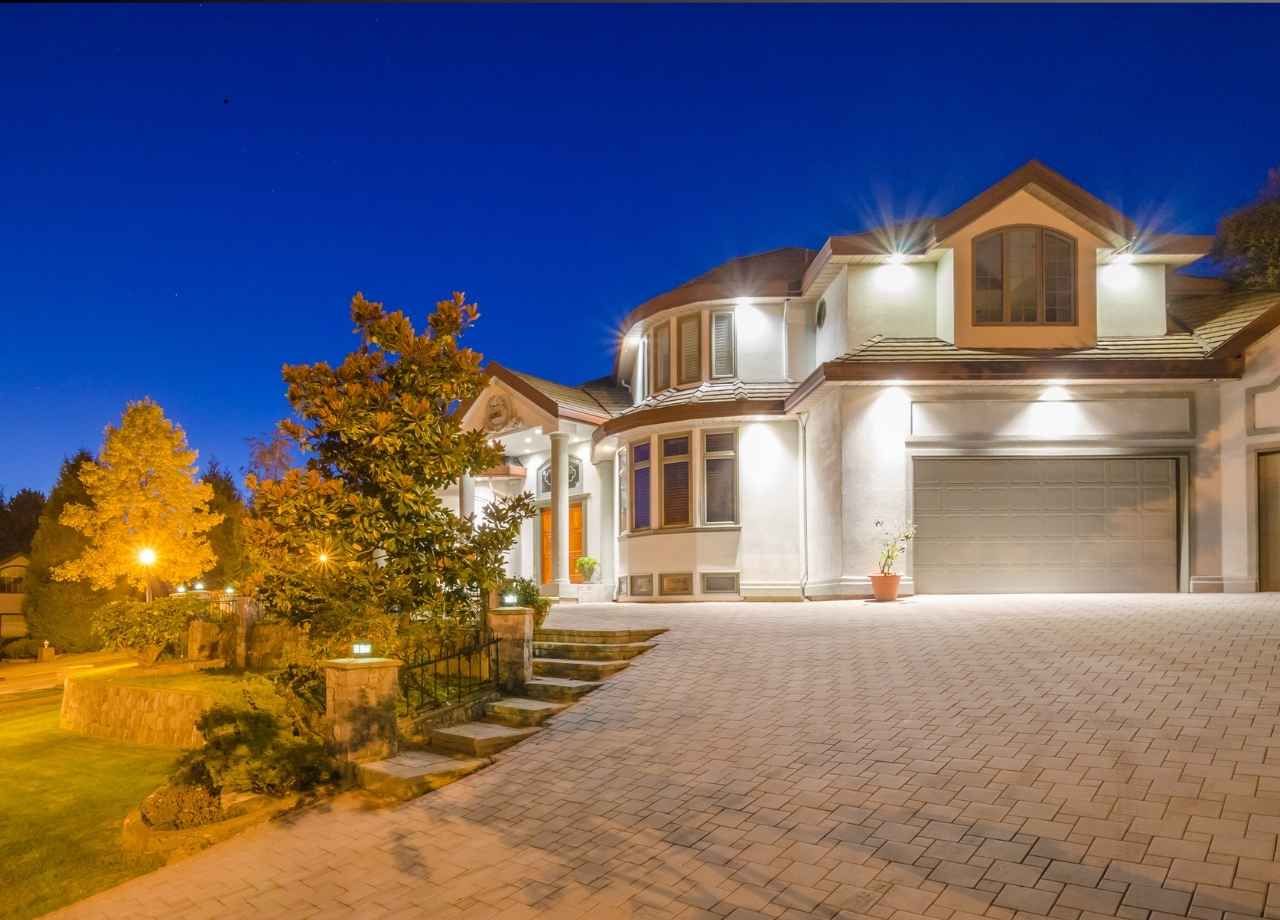
Cooler white light between 3500K and 4000K serves a purpose when used strategically. Contemporary homes with gray, black, or white facades sometimes benefit from a slightly cooler tone. Modern architecture often features sharp lines and smooth finishes that pair well with a cleaner white light.
Security lighting can also lean toward 3500K or 4000K. These temperatures improve visibility in work areas, driveways, and garages where task lighting matters more than ambiance.
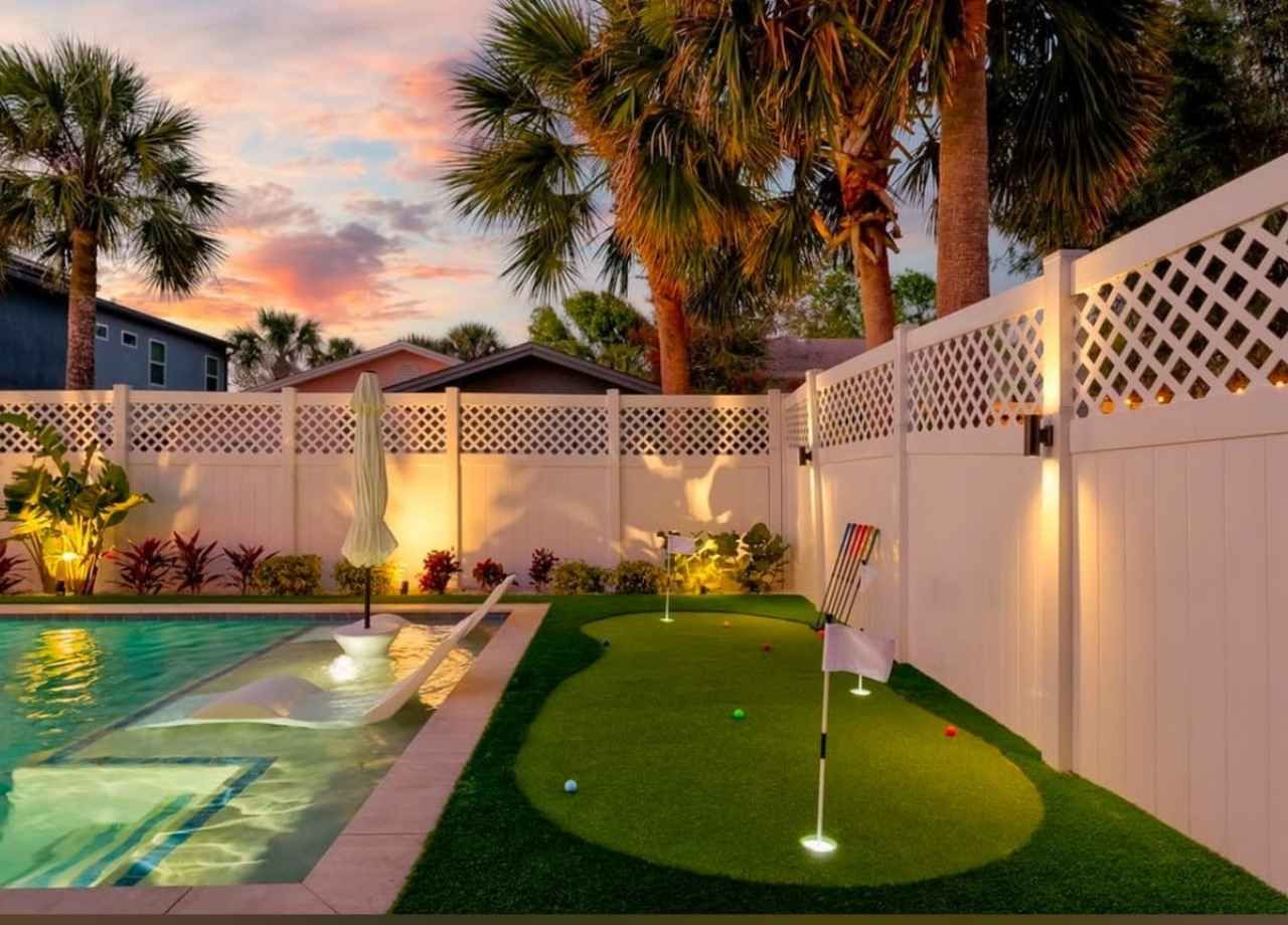
Landscape features with silver or blue-toned foliage may respond better to a neutral white light. Palms, ornamental grasses, and certain decorative stones can appear crisper under 3000K to 3500K lighting compared to very warm tones.
Caution is essential when moving beyond 4000K in residential settings. Excessively cool light tends to feel commercial. It can overpower landscaping and create uncomfortable glare, especially in humid coastal environments where moisture reflects light differently at night.
The Impact of 2200K and Amber Lighting
Lower color temperatures around 2200K produce a deep amber glow. This range has gained popularity due to dark-sky initiatives and concerns about blue light pollution. Amber lighting reduces skyglow and minimizes disruption to nocturnal wildlife.
Coastal areas, including parts of Florida, often recommend warmer lighting near shorelines to protect sea turtles. Blue-rich white light can disorient hatchlings, while amber tones reduce that risk.
Homeowners who prefer a soft, resort-style atmosphere may gravitate toward 2200K lighting for patios and garden paths. The result feels intimate and relaxed. The tradeoff is reduced color rendering. Whites and cool tones may appear muted under very warm light.
Combining 2200K for seating areas with 2700K or 3000K for architectural highlights can create depth without sacrificing visibility.
Color Rendering and Why It Matters Outdoors
Color temperature and color rendering are related but different. Color Rendering Index, or CRI, measures how accurately a light source reveals colors compared to natural daylight.
High-quality LED landscape fixtures should have a CRI of 80 or above, with premium systems reaching 90 or higher. A higher CRI ensures plants, flowers, and exterior finishes appear natural instead of distorted.
Warm light with a high CRI makes red brick glow richly and preserves the true green of landscaping. Lower-quality LEDs often shift colors in ways that make lawns look dull or bluish.
Professional-grade systems use carefully engineered diodes to maintain consistent color output over time. That consistency prevents mismatched fixtures years after installation.
How Architecture Influences the Right Color Choice
Architecture guides lighting decisions more than most homeowners realize. A Spanish-style home with terracotta roofing thrives under 2700K lighting. A sleek modern residence with white stucco and black trim often benefits from 3000K or slightly higher.
Stone veneers with warm undertones look muddy under 4000K lighting. Cool gray stone may appear yellow under 2200K lighting. Testing sample fixtures before full installation ensures compatibility.
Jacksonville’s coastal humidity also affects how surfaces reflect light. Moisture in the air slightly diffuses beams, softening their appearance. That effect makes ultra-cool lighting feel even harsher compared to dry climates.
Balanced lighting layers create dimension. Uplighting architectural features in one consistent color temperature while softly illuminating paths in a complementary tone maintains cohesion.
Landscape Design and Plant Response to Light Color
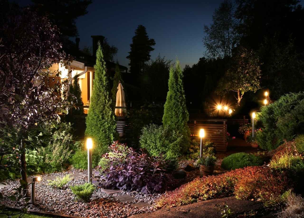
Plants respond differently to light color at night. Warm light enhances red and orange foliage. Neutral white light sharpens the appearance of silver, blue, or variegated leaves.
Palm trees often look best under 2700K to 3000K lighting because the fronds maintain depth without looking washed out. Flowering plants benefit from higher CRI fixtures to preserve petal color.
Cooler light can flatten dense hedges and make lawns appear artificial. Overly warm light can obscure subtle texture in ornamental grasses.
Layered lighting allows subtle variation. Tree canopies, focal shrubs, and groundcover can each receive tailored beam spreads and carefully selected color temperatures. This approach creates contrast without visual clutter.
Safety, Visibility, and Human Comfort
Outdoor lighting must balance ambiance with safety. Path lights around 2700K to 3000K provide clear visibility without glare. Cooler light can create sharp contrasts that strain the eyes when transitioning from indoors to outdoors.
Human vision adapts better to warm light in residential settings. Blue-rich light scatters more in the eye, increasing glare and perceived brightness. That is one reason parking lots often feel uncomfortably bright at night.
Driveways and work areas may benefit from slightly cooler tones for clarity. The key is avoiding extreme differences in color temperature across the property. A mix of 2200K patio lighting and 5000K floodlights would feel disjointed and uncomfortable.
Consistency maintains visual harmony and improves long-term satisfaction.
Smart Lighting and Adjustable Color Temperatures
Modern LED systems allow adjustable color temperatures. Tunable fixtures provide flexibility for seasonal changes or entertaining. A homeowner might prefer 2700K for daily use and slightly warmer tones for outdoor gatherings.
Smart controls also allow dimming, which significantly affects perceived color. As LEDs dim, some high-end systems shift slightly warmer, mimicking incandescent behavior.
That flexibility eliminates the need to over-light areas. Properly calibrated systems maintain efficiency and extend fixture lifespan.
Environmental Considerations and Dark-Sky Awareness
Outdoor lighting design now considers environmental impact more than ever. Warmer color temperatures reduce blue light emissions, which contribute to skyglow.
Dark-sky compliant lighting uses shielded fixtures and appropriate color temperatures, typically 3000K or lower. This approach preserves nighttime views and reduces disruption to wildlife.
Florida communities increasingly value responsible lighting. Choosing warmer tones supports that goal without sacrificing beauty.
Energy efficiency also plays a role. LED fixtures consume significantly less energy than traditional halogen systems. Pairing efficient technology with thoughtful color selection creates sustainable long-term performance.
Bringing It All Together
Warm white lighting between 2700K and 3000K remains the best choice for most residential outdoor applications. That range enhances architecture, flatters landscaping, and creates a welcoming atmosphere. Cooler tones serve specific modern or task-oriented needs when used carefully.
Amber 2200K lighting offers an intimate glow and supports environmental considerations, particularly in coastal regions. High CRI fixtures ensure natural color representation regardless of temperature.
Successful outdoor lighting design blends color temperature, beam angle, fixture placement, and brightness into a cohesive system. Random fixture selection often leads to mismatched tones and inconsistent performance.
Thoughtful color selection elevates curb appeal, improves safety, and creates a refined nighttime environment. When the right temperature meets professional design and installation, a property transforms into a balanced, inviting space that feels just as beautiful after sunset as it does during the day.